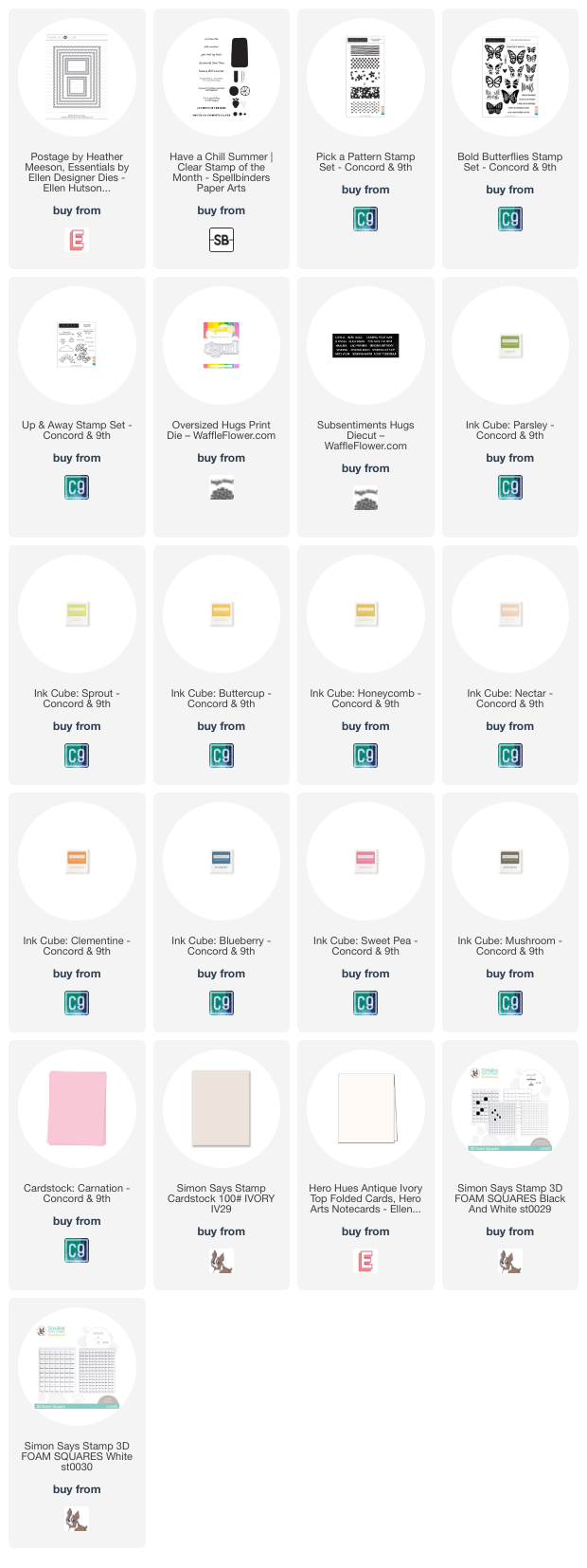

Ellen Hutson—Postage Stamp Hugs Card

Happy Tuesday, Crafters!
So sorry for only sharing one post last week, but this card took me a little bit longer than I expected! I got way too in my head about things (as usual 🙃) so I wanted to keep fussing. This card features a lot of products from different companies, so raid your stash and see what you can come up with! I had a lot of fun making my own stamps, and I’m going to be playing around with the larger dies in this die set this week (as long as I didn’t chase my mojo away with this card 🤞).
When I started on this card, I had nothing planned out. I started making a list of things I wanted to create with the Postage die set in a note on my phone (think of it like a brain dump—writing everything down that was coming to mind), but I knew I wanted to use the new ‘hugs’ die that Waffle Flower released this month. A family member has been having a bit of a rough week, so I was planning to make this card and send it out to them. I didn’t have a color palette in mind when I got started on this card, but I pretty much followed the citrus stamp’s color palette in the end. Makes things a little bit easier, and a little bit more cohesive!
This die set only has 2 smaller postage shapes (they all come with a nesting rectangle that’s to scale for that size), and after a bit of playing around with a layout, I decided on using two of the original shapes, and partial die cutting them to make two more. This really helps you stretch the use of the die set, and I love that! When it came to partial die cutting, I die cut the square stamp (the normal size is the butterfly stamp) and lined the die up to where it would cut off two rows, taped it down, then ran it through my die cut machine. I repeated this same process with the long, skinny rectangle and took off a couple rows off the height, and one off the width. I love how these turned out!
Now onto the designs. After raiding my stash and pulling out way too many stamp sets, I started off with the Have a Chill Summer stamp set from Spellbinders. This set was a Clear Stamp of the Month set from July of last year, but you can purchase it on their website now if you want it. I stamped the citruses in Sprout/Parsley, Buttercup/Honeycomb, Nectar/Clementine, and stamped the blueberries in Blueberry ink. I thought about adding white gel pen details to the blueberries, but didn’t want to chance ruining the scene, so I left them alone! I cut this scene down using my paper trimmer to give myself some white margins by eyeballing it, and I’m pretty happy with how this stamp turned out!
Next up, I went for florals! I pulled out the Pick A Pattern stamp set from Concord & 9th and pulled out some colors. Originally, I had stamped this using Peacock and Grapefruit, but to me it felt off. I decided to restamp it using Blueberry for the background (looove this color and how it ties into the citrus stamp!), Sweet Pea for the flowers, and Honeycomb for the little dots. I trimmed this down using my paper trimmer and glued it onto the corresponding postage die.
For my third stamp, I was inspired by the Colorado Hairstreak postage stamp. I originally set off to create a very similar image (by stamping or die cutting one), but settled on this design since it pulled back into the colors of my citrus stamp. I pulled out the Bold Butterflies stamp set from Concord & 9th and got to work. I decided to stamp the wings in Mushroom ink because it’s a bit softer than black, then decided to ombre stamp the inside wing portion with Buttercup and Clementine ink. I love how this turned out, and how it feels cohesive with the rest of the stamps!
Now for the last one. After a bit of back and forth, I decided on using the sunburst image from the Up & Away stamp set from Concord & 9th. I really like this image and the idea of having a bit more whitespace in this stamp to balance the layout out, so I stamped it in Sweet Pea ink. This ties in perfectly to the floral stamp, and I couldn’t be happier with these four designs! The possibilities and combinations of products are endless!

With my stamps ready to go, I worked on my sentiment before gluing everything down. I die cut the Oversized Hugs Print die out of Carnation cardstock after my friend Jan suggested it. I went back and forth on what color to use as my sentiment, and she suggested using some of the colors in my images. Once I die cut the ‘hugs’ out of Carnation, I knew that was the winner! I die cut two extra hugs out of white and layered them all together. I decided to combine the ‘hugs’ with a ‘sending’ sentiment strip from the Subsentiments Hugs diecut, also from Waffle Flower. And let me tell you, I LOVE these! I love that Waffle Flower has created these so that the sentiments are precut (you just have to gently tear them apart). I have a lot of the Simon Says Stamp sentiment strips, and I don’t reach for them that often, and they can be a pain to cut at times. All the pain is taken out of that, and Waffle Flower chose some great phrases that work really well with their Oversized Print die line (I used a lot of these in the May blog hop), or as a main sentiment on a card. After going around the edge of my sentiment strip with a Sharpie to darken the edges, I used some extra paper strips I had to reinforce the back.
At this point, I decided I would build my card on a 3.75 x 5 -inch piece of white cardstock (this is a heavier one that I found but I’m not sure what it is since it was all alone—must have come from a card kit!) and mat it on a piece of SSS Ivory. To make my life a little bit easier, I decided to pull out Press’n’Seal for this job. A trick I picked up from Dawn at Wplus9 (here’s her Youtube, I love her videos!) is to temporarily adhere your card base to your surface, then burnish the piece of Press’n’Seal to your surface to make a hinge. This honestly makes it soooo much easier than trying to line up your images by hovering over the cardstock and trying to see through the Press’n’Seal. After arranging my stamps, I picked them up with the Press’n’Seal, then covered the backs of them with thin foam squares. I decided to use the dimension here because it would make the postage stamps stand out a bit from the white background since the edges of my stamps were also white. I stuck my postage stamps on the card front, then added thick foam squares to the back of the ‘hugs’ and to portions of my sentiment strip. I decided to glue my white panel onto an Ivory panel because I thought having foam tape there might make it too bulky to mail. I decided to pop this card front onto a top-folding Ivory cardbase (I could have saved a piece of cardstock had I known I would be using an Ivory cardbase!) and called this card done.
So, what do you think about this card?! I felt like I lost my way in the middle of it, but I’m pretty happy with how it turned out! And I love that you could create any type of stamps that your heart desires! Thanks so much for stopping by the blog today, I hope to catch you next time with more inspiration! Until then, happy crafting! 😊
Affiliate disclaimer: all links to Waffle Flower, Altenew, Scrapbook.com, and Spellbinders products are affiliate links. These links allow me to get a commission at no extra cost to you if you use them to shop! All other links provided are links to supplies and shops I am not affiliated with and I do not get a commission from.