
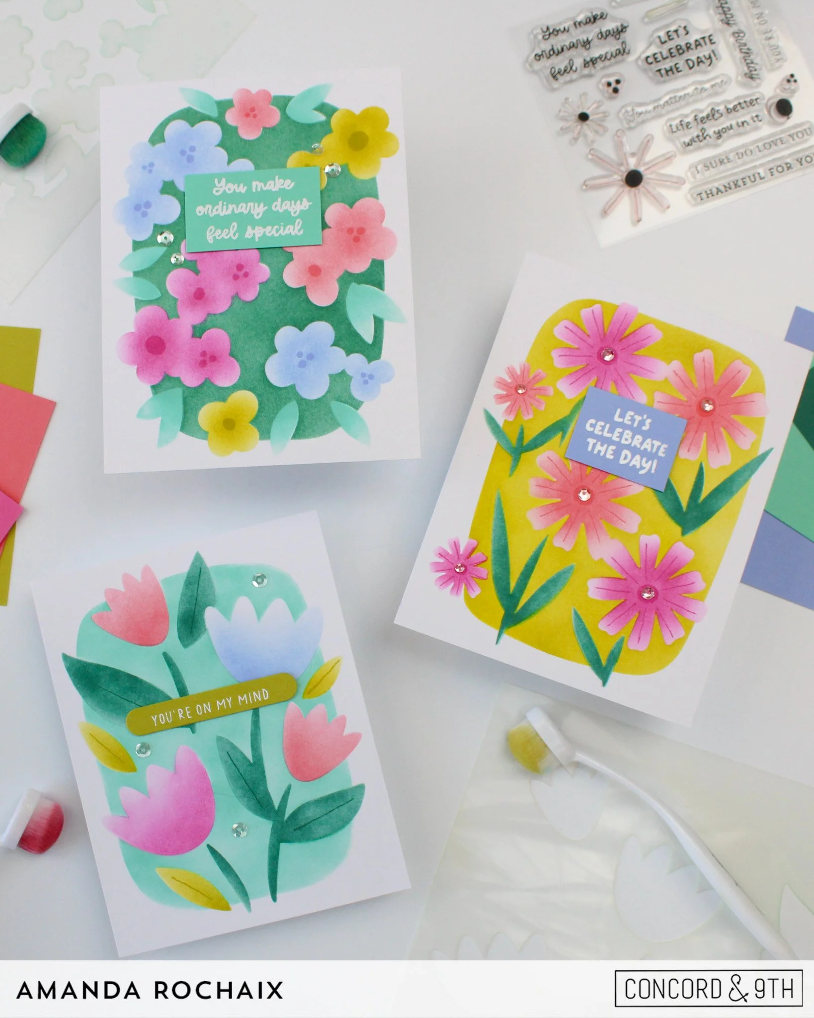
Hi friends! Today I’m back with more inspo from the Concord & 9th July release, this time featuring the Petal Portraits Bundle! I know I say this a lot, but I truly love this bundle! And honestly, have Concord & 9th ever released a ‘bad’ bundle? I think not! This one though, this one makes my heart so happy because it combines a gorgeous variety of floral scenes in one set. Quick & easy card sets, anyone? That was my inspo for these three cards today— I wanted to create a set that I could gift to someone, and I’m so thrilled with how these turned out!
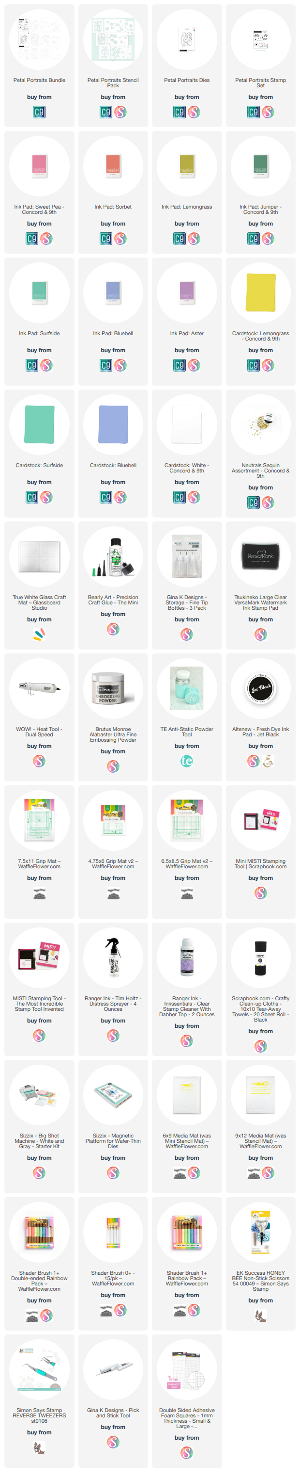
For these cards, I used the color palette I suggested would go great with this release: Juniper, Lemongrass, Bluebell, Sweet Pea, Watermelon, Honeycomb, Aster, and Surfside. Is it a giant palette? Yes. But do I love all the opportunities to play with this many colors for this set? Also yes! So, let’s get into the details!
Loudly Lemongrass
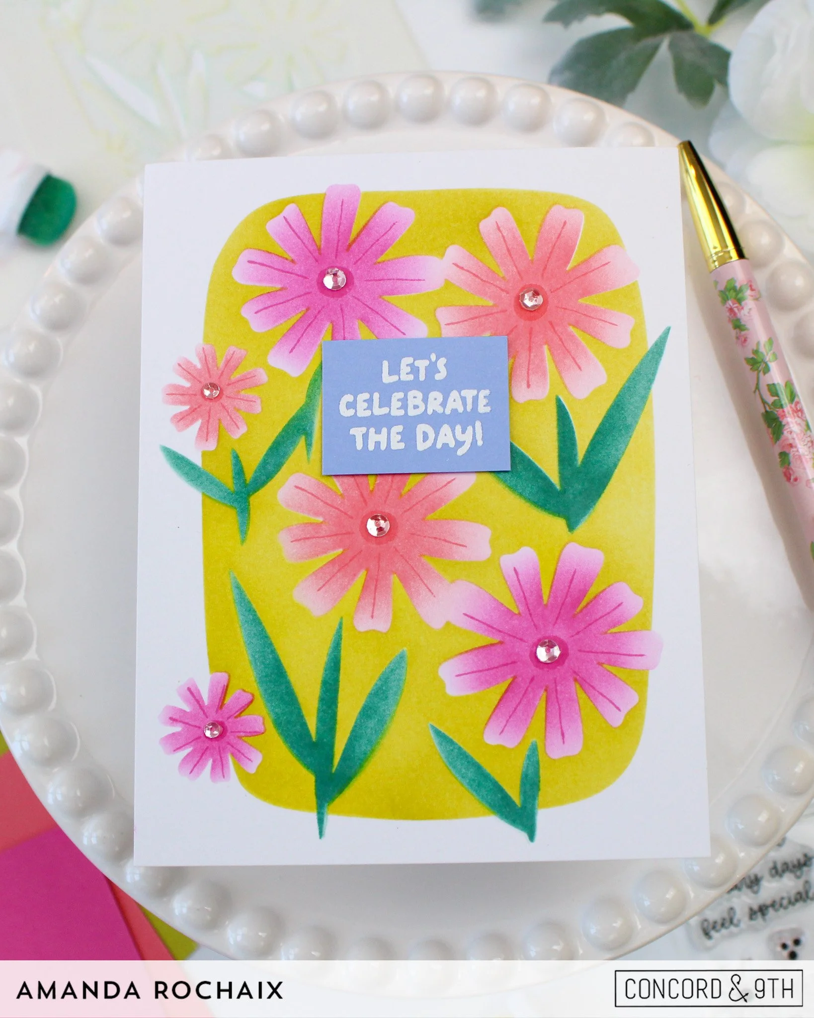
We’re kicking this off with a bold card, that’s for sure! Was Lemongrass the wrong choice for a background? I’m gonna say no, but I totally understand if someone said yes! She is veryyyy loud here. One thing I would suggest is actually using a pouncer when blending this background because I definitely knocked some leaves/stems out of place when blending, hence some fuzzy edges!
When it came to adding the leaves, I thought that Juniper would be really nice. Juniper and Lemongrass are wonderful friends and I think that’s proven here! For the flowers, I went with two colors and bounced Sweet Pea and Watermelon ink around so that they were evenly distributed, this is definitely a me being particular type of situation, so know that you can just follow the stencil as is! When I was blending on the flowers, I did focus my ink/brush in the center of each bloom to create more of a halo and to leave the tips of the petals a little bit lighter.
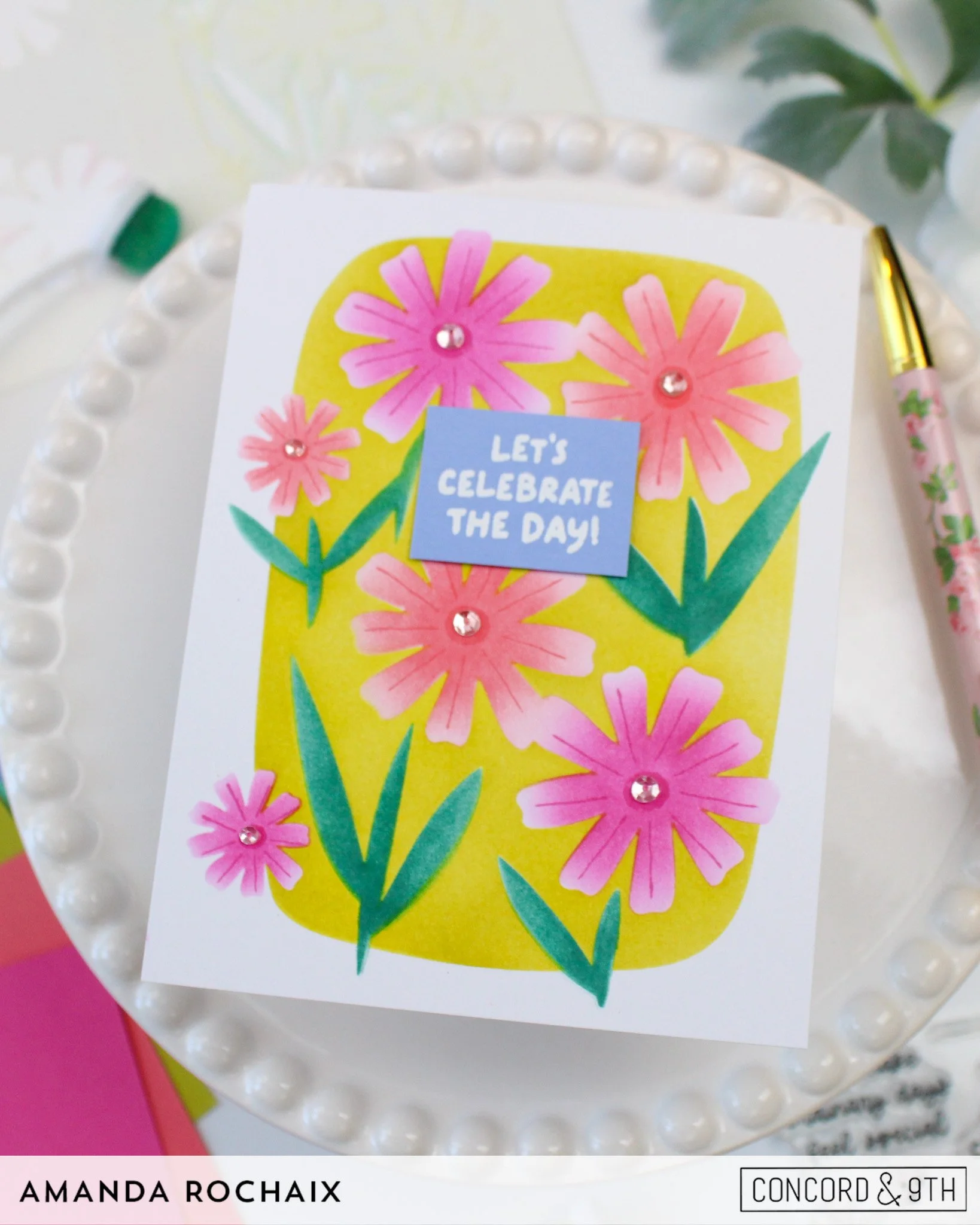
To add some sweet details to the flowers, I grabbed the stamp set and stamped on the petal lines and floral centers using the same ink colors I blended them in for some tone-on-tone action. To add a little bit of sparkle to the card, I decided to add some clear sequins to each flower center, and I love what this brought to the card! Lastly, to finish this card off, all I needed was my sentiment. I decided to white heat emboss the ‘let’s celebrate your day’ sentiment from the stamp set on some Bluebell cardstock, then trim it down to a rectangle. You may be thinking the Bluebell is a little too wild, but when I popped it on this card, it really added something great!
Happy Little Flowers
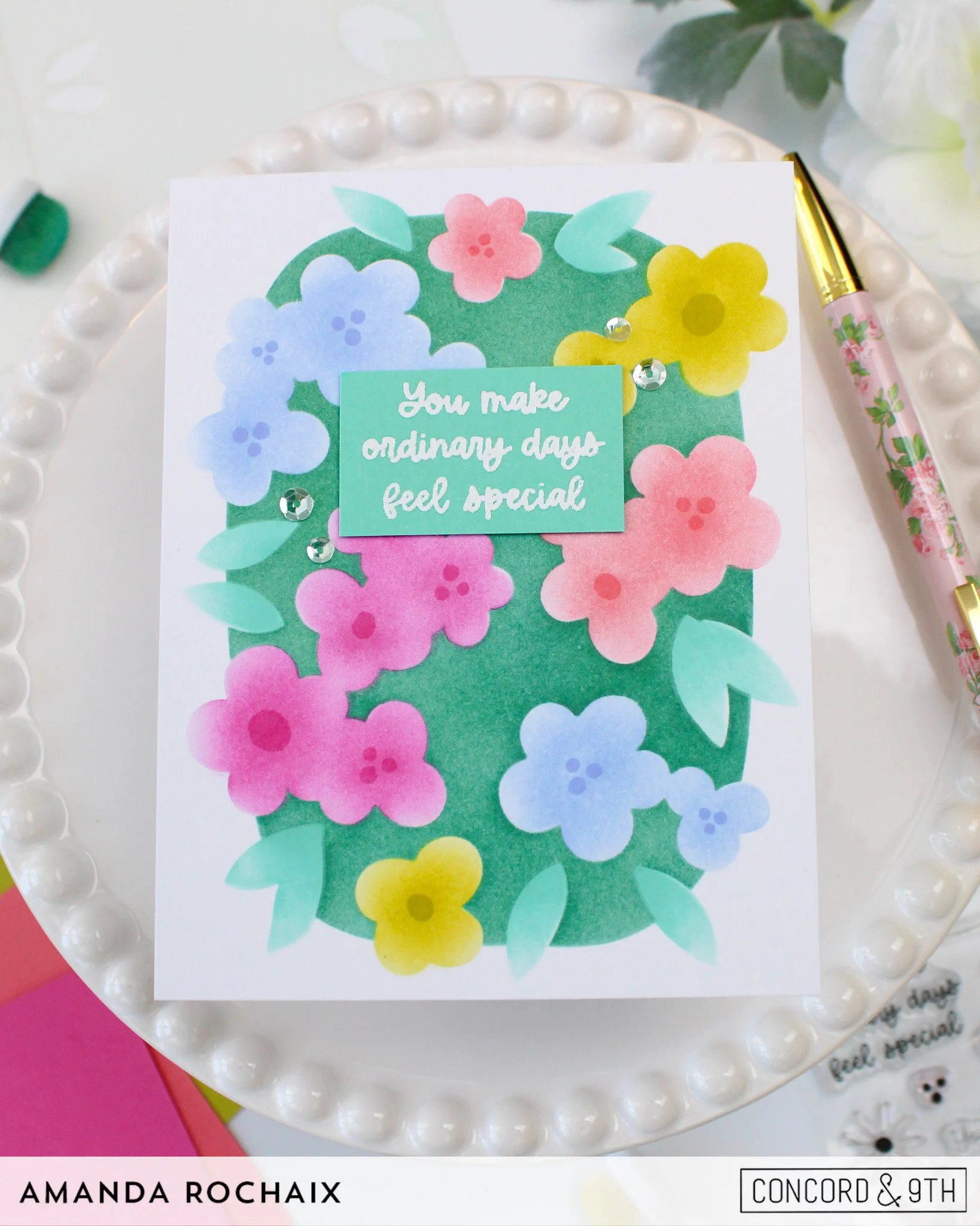
Dare I say this card is my favorite of the set?! I absolutely adore everything about it, especially all of the colors! To start this one off, I blended the background in with Juniper ink for a darker background vs. my previous card. I decided I didn’t want to invert the last card and make the leaves Lemongrass, so I went with Surfside! This was my first time ink blending with Surfside, and I love it! It’s such a cooler, brighter minty green than Sea Glass (which is one of my loves), so I can see myself using this in florals lots!
From here, I just got to bouncing my colors around, blending on Sweet Pea, Watermelon, Lemongrass, and Bluebell in a way that made the colors feel balanced. Just like the last card, when I was blending these flowers on, I was focusing my brush in the center of the flower to get that sort of petal-tip highlight.
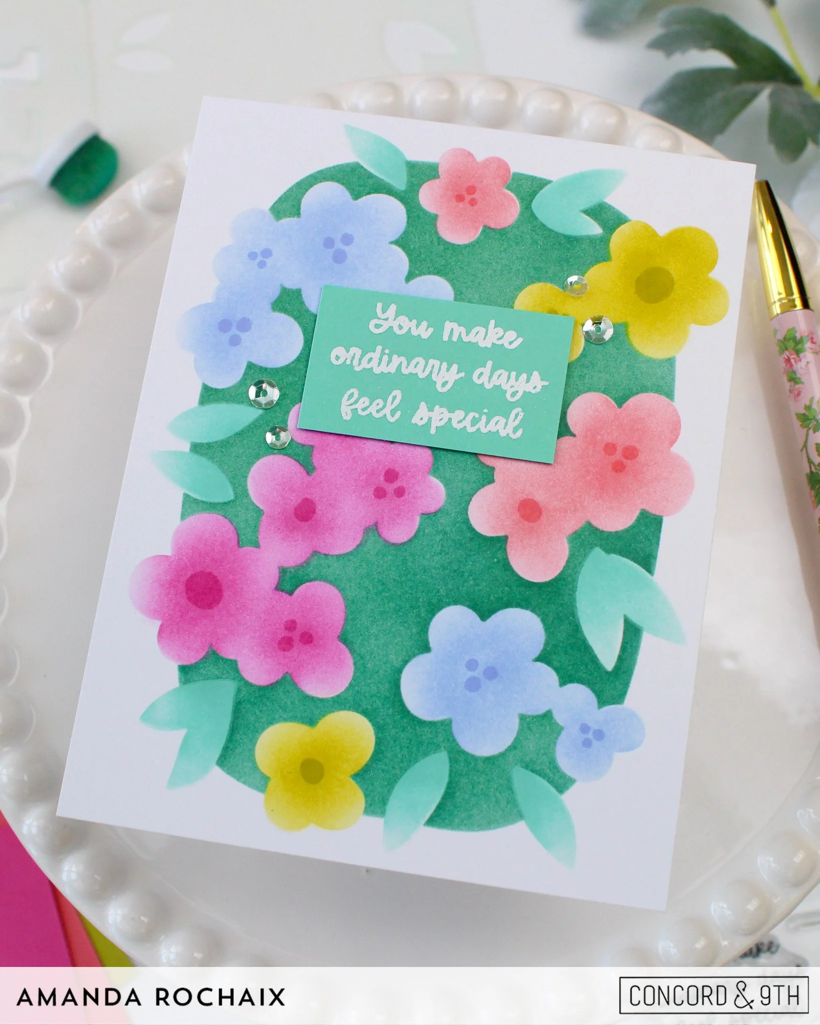
For the flower centers, I decided to stamp them tone-on-tone again because I was loving that sorta subtle look. When it came to the sentiment, I decided to stick with it being white heat embossed on colored cardstock, so this time I decided to stamp it on Surfside cardstock. The sentiment doesn’t have as much contrast as the last card, but it felt right to me, and I couldn’t really use any of the other colors without it feeling potentially too heavy on that color. To finish the card off, I pulled out the same Neutrals Sequin Assortment and popped two of the silver ones on each side of the sentiment. I also considered adding flower centers with enamel dots for more shine, but I stuck with the stamping.
Whimsical Tulips
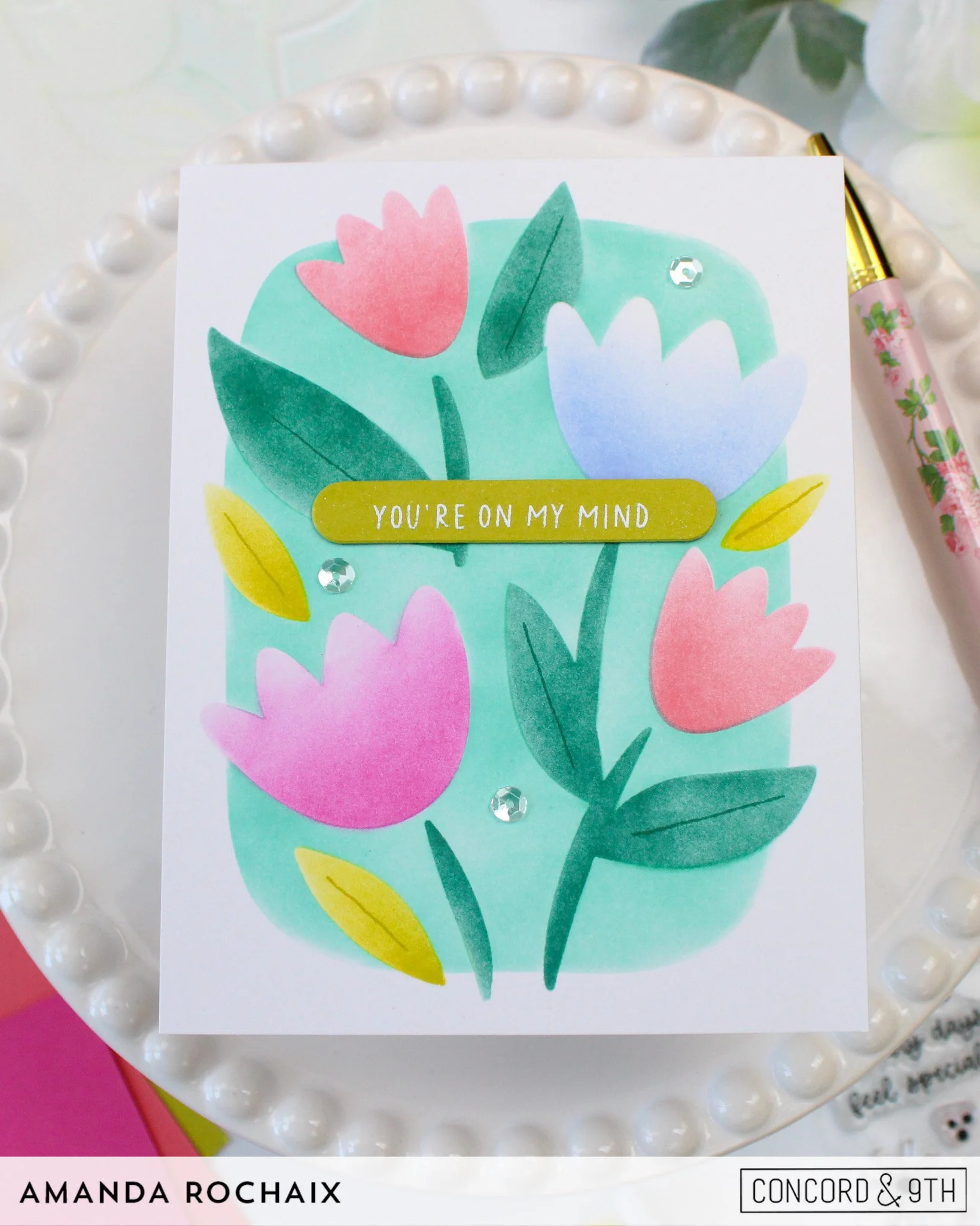
I won’t lie to you, this card messed with my brain a little bit! And honestly, looking at it now, I wonder if I shouldn’t have made that one tulip Bluebell-colored! For the background on this card, I decided to go with Surfside since it was different from Lemongrass and Juniper, but maybe it would have been fun if I did it in Watermelon instead! Although at least this way the set of cards has a consistent background color in the blues/greens! I would also suggest using a pouncer when blending this background or gently holding the leaves/flowers in place when you blend around them!
For the leaves, I went with Lemongrass and Juniper to bring those colors back in. The flowers were blended on with Watermelon, Sweet Pea, and Bluebell. I almost wish there was a 5th flower in this design because I did a lot of overthinking over these 4 blooms! I wasn’t sure if I should bring in more than 2 colors, but I really like incorporating as many colors of my color palette as possible.
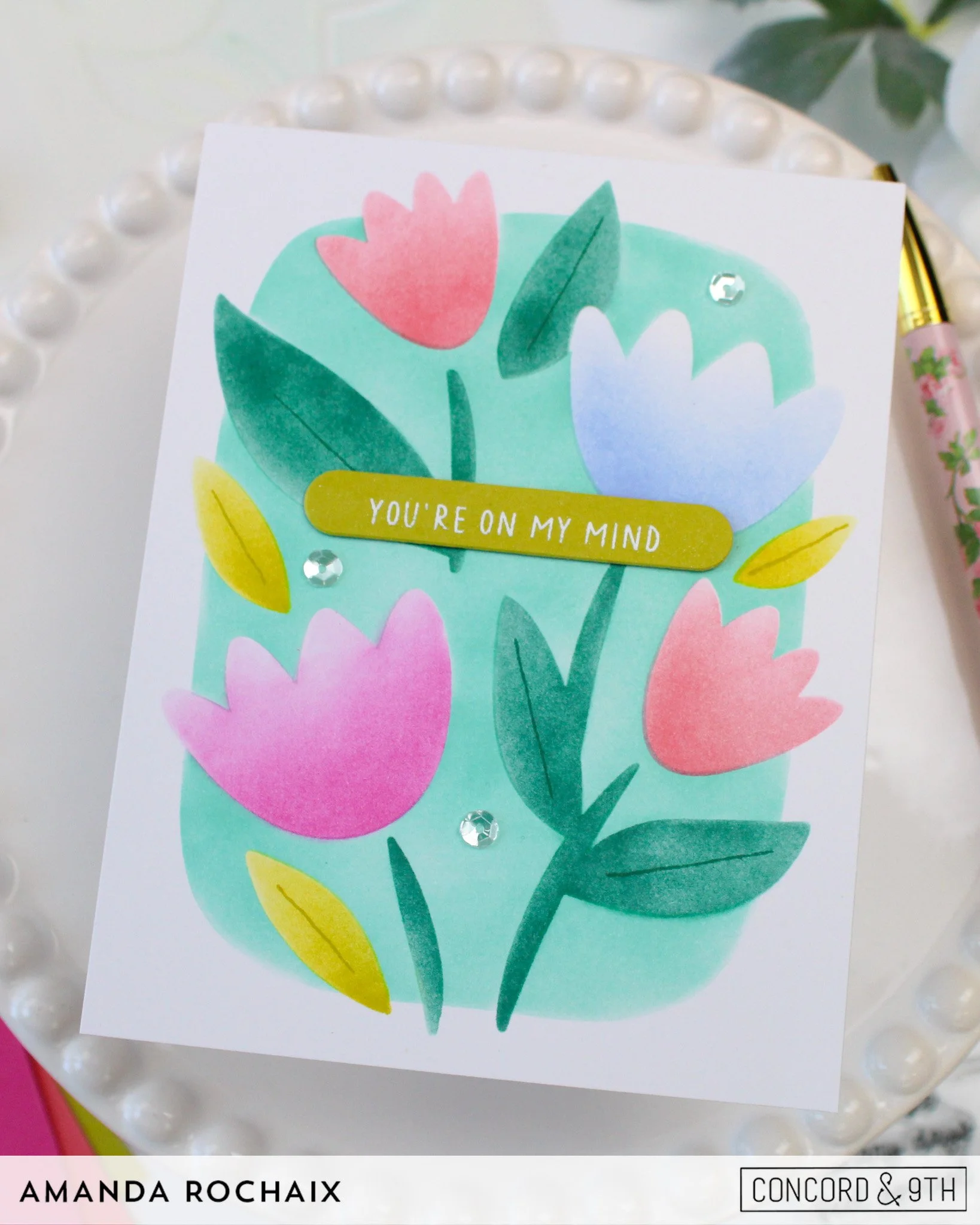
For my sentiment, I decided to white heat emboss ‘you’re on my mind’ on Lemongrass cardstock. Once again, I added the stamped leave details in the same inks for tone-on-tone details. To finish this off with that little hint of sparkle, I added a handful of neutral sequins again around the card.
That wraps up this set of cards! I really had fun with this set and need to pull it out again to play with more colors! Do you have a design that’s your favorite? Let me know below! As always, thanks so much for stopping by the blog today, I hope to catch you next time!
Affiliate disclaimer: all links to Waffle Flower, Concord & 9th, Altenew, Scrapbook.com, and Spellbinders products are affiliate links. These links allow me to get a commission at no extra cost to you if you use them to shop! All other links provided are links to supplies and shops I am not affiliated with and do not get a commission from.