
Getting My Crafty Mojo Back & Playing With New Colors!
Hey, crafters!
Lately my crafty mojo has been going missing on me—I can create for my design work, but I’ve been dying to play with products I want to use, but I haven’t had luck breaking the barrier between wanting and doing. There are so many products I want to play with that I’ve been getting decision fatigue trying to pick what to use, then feeling it even more when I try to think of a color palette to use. Unnecessarily overwhelming, right?
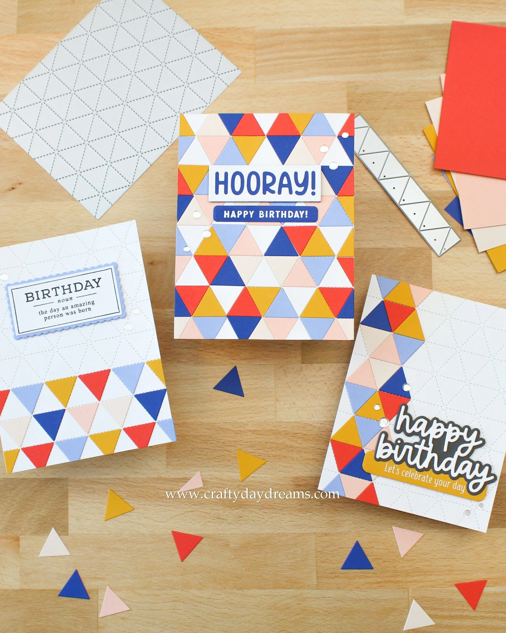
Well, I did what I’ve done in the past, and I stripped things back a bit. Today, my three cute cards feature the same die set, the Triangle Background Die from Concord & 9th, and share the same color palette! This die set is one of my favorites (though Concord & 9th have many like it—my other favorite is the Honeycomb Quilt Top Dies!) that I’ve gone back to many times when I either need cards made quickly, or I’m looking for my mojo again. All this die forces me to do is play with color—there’s way less thinking (if I’m doing it right haha!) involved, and then all you need is a sentiment because this die set guarantees a gorgeous background no matter what you make. I noticed my birthday card stash was a little lacking, so my whole focus of my crafting session was to play with color, think way less, and make some birthday cards.
New Colors!
If you haven’t heard, Concord & 9th has just come out with 6 new colors for the year (not the mention an expansion on their Neutrals collection too!) and they’re called Berry Kiss (a punchy red-pink), Basil (a yummy mid-tone green that’s a perfect medium between Parsley and Evergreen), Surfside (a vibrant blue-green, think Sea Glass but more saturated!), Bluebell (a more periwinkle blue), Capri (a gorgeous saturated royal blue), and Aster (a lovely warmer purple that’s a perfect medium between Lilac and Fig). If you’re like me and you’re impatient to get new colors in your hand early every year, Concord & 9th has created a Color Club where you get samples of the new papers and an exclusive die set, too! I’ve purchased it the past two years in a row, and I really love doing so!
I was dying to play with some of these new colors, so I found one of my favorite color palettes on my Pinterest board that I can now create in a more true to color way which absolutely thrills me! So, with that said, my color palette to play with was: Pimento, Nectar, Sunflower, Bluebell, Capri, and Almond (this is one of their great neutrals!). I specifically chose 6 colors today in order to make playing with this die set easier since you do make a beachball shape with 6 triangles, but you could play with as many or as few colors as you would like!
A Full Background
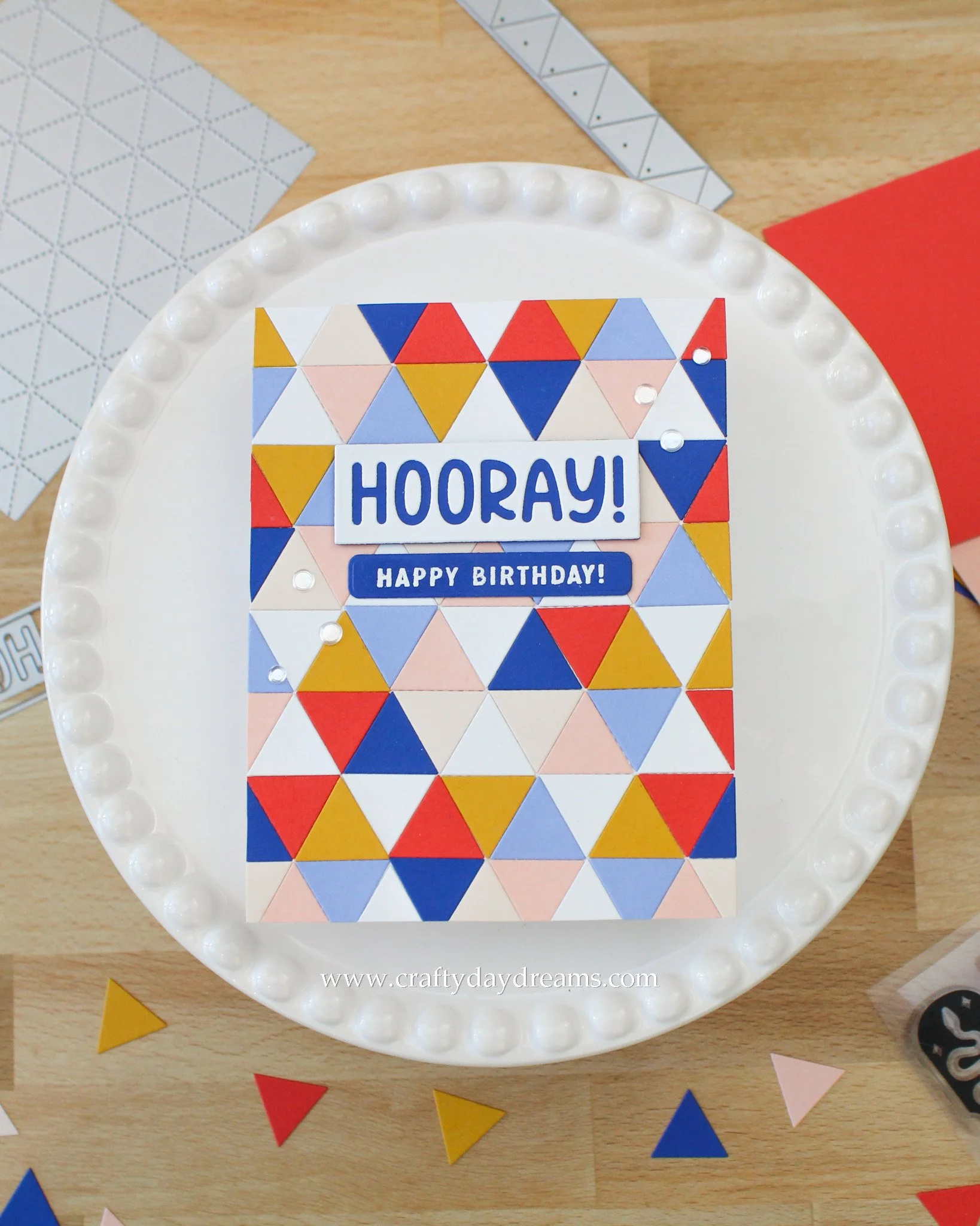
To kick things off nice and easy, I decided to create a full background panel. I will say, the hardest part of this for me was creating my original beachball pattern. That took me a bit, but my thought process behind it was to try and make it as balanced as possible. That, to me, meant balancing saturations. You’ll see across from each color is a lighter shade of it: Bluebell is across from Capri, Nectar is across from Pimento, and Almond is across from Sunflower. This felt super nice to me when I first arranged it, so I went with it.
Since I wanted my pattern to have a little bit of variation across the panel, I kept moving the colors around, but kept them in the same order. Once I liked what I saw, I glued all the triangles down to my cardbase of 80lb Neenah Classic Crest Solar White that I ran through my die cut machine with the panel die. I ended up including white “spacer” triangles to keep everything the same thickness across the page. I would say when gluing this many triangles down, or even across the width of a card front, you might want to start in the middle and work your way out! That way your triangles can be placed a bit more accurately, and if you end up with more overhang because things shifted, then you can trim it off easily vs. trying to squish it in position!
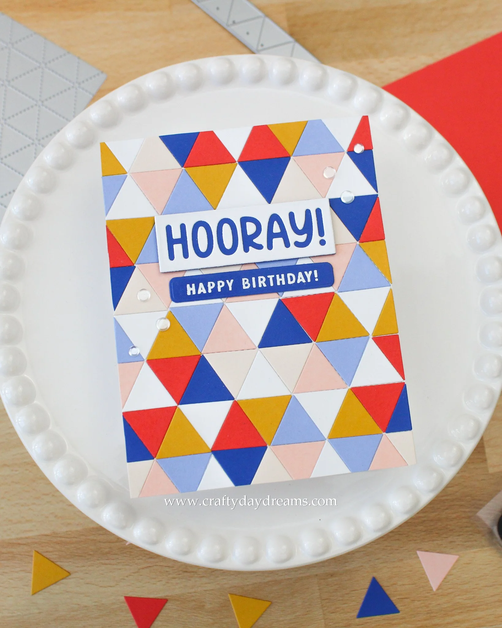
Now onto the sentiment! I raided my stash for these cards, and I love that in doing so I have three different sentiments! For this card, I pulled out a die set that I havent used yet—the Simple Sayings Dies. I die cut the ‘hooray!’ out of white cardstock, then used the rectangle die again to die cut a Capri backer. Once I had the pieces glued together, I popped the letters in place so that I could glue down the inner pieces. How great do the Capri letters look?! To bring more Capri to the panel in an area where it was lacking, I decided to stamp and white heat emboss a subsentiment on it from the Bootcut Stamp Set. I ended up using my Altenew Featured Sentiments Die Set to cut it out and give it some rounded edges (some partial die cutting was involved to trim my strip down a little!). I popped the ‘hooray!’ up on some thin foam squares, then added a strip of cardstock behind my subsentiment for a smidge of dimension, then glued it down.
To finish things off, I pulled out my Rock Candy sequins from Trinity Stamps and added two groups of three! I love how fun and playful this card is!
A Beachball Stripe
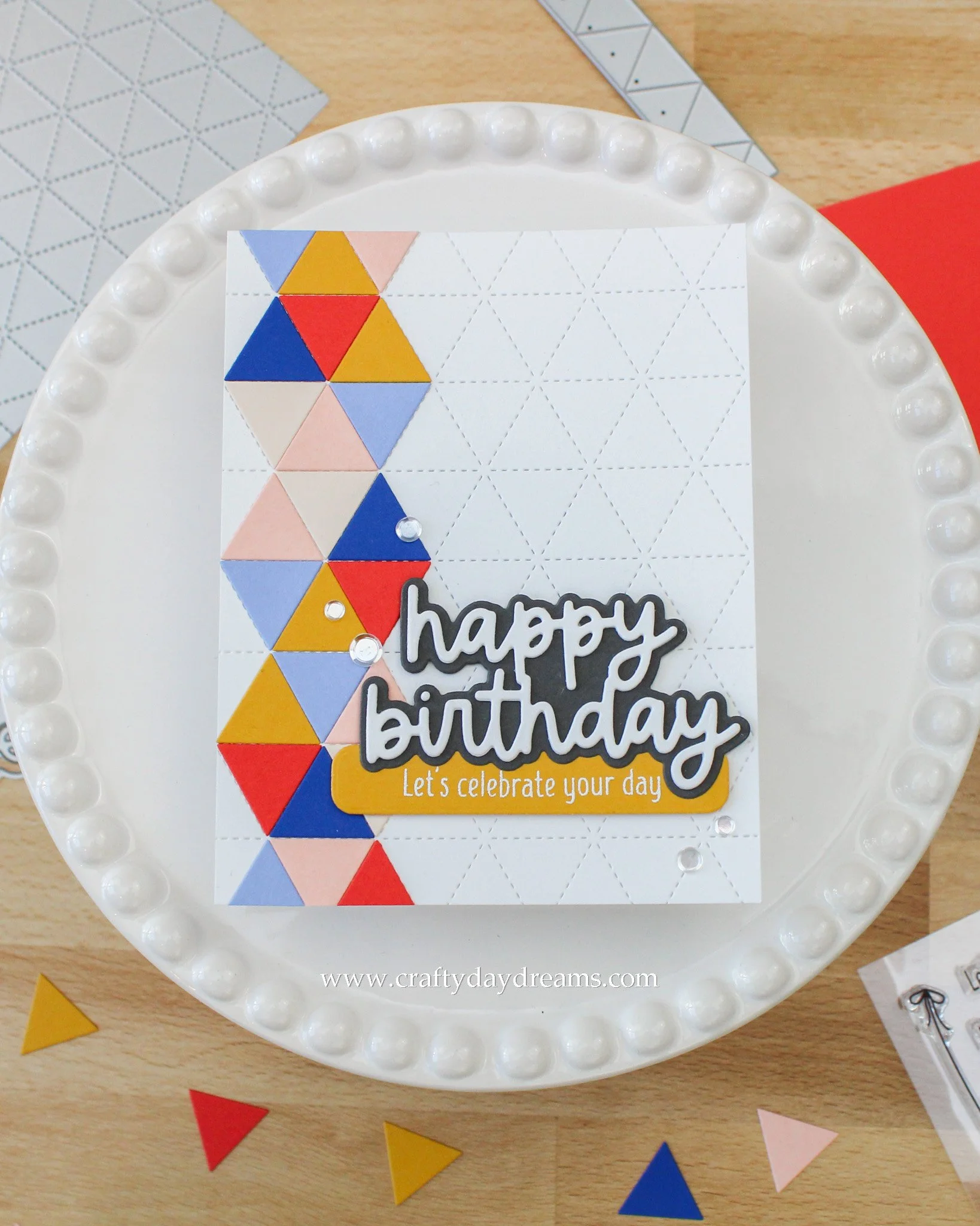
Okay, so I maybe cheated a little when it came to playing with this set today. In the past when I created with these dies, I also did a little beachball strip down the side of my card, but I really loved it, so I wanted to do it again! I’m really not creating in an original way with any of these cards, but I am making cards, and that’s what’s most important!
For this card, I didn’t pay as much attention to keeping the order of colors to be exactly the same as the previous card but instead focused on bouncing colors around and making things feel balanced and well represented. Once I felt happy with how things looked, I glued the triangles down to a panel of 80lb Neenah Classic Crest Solar White.
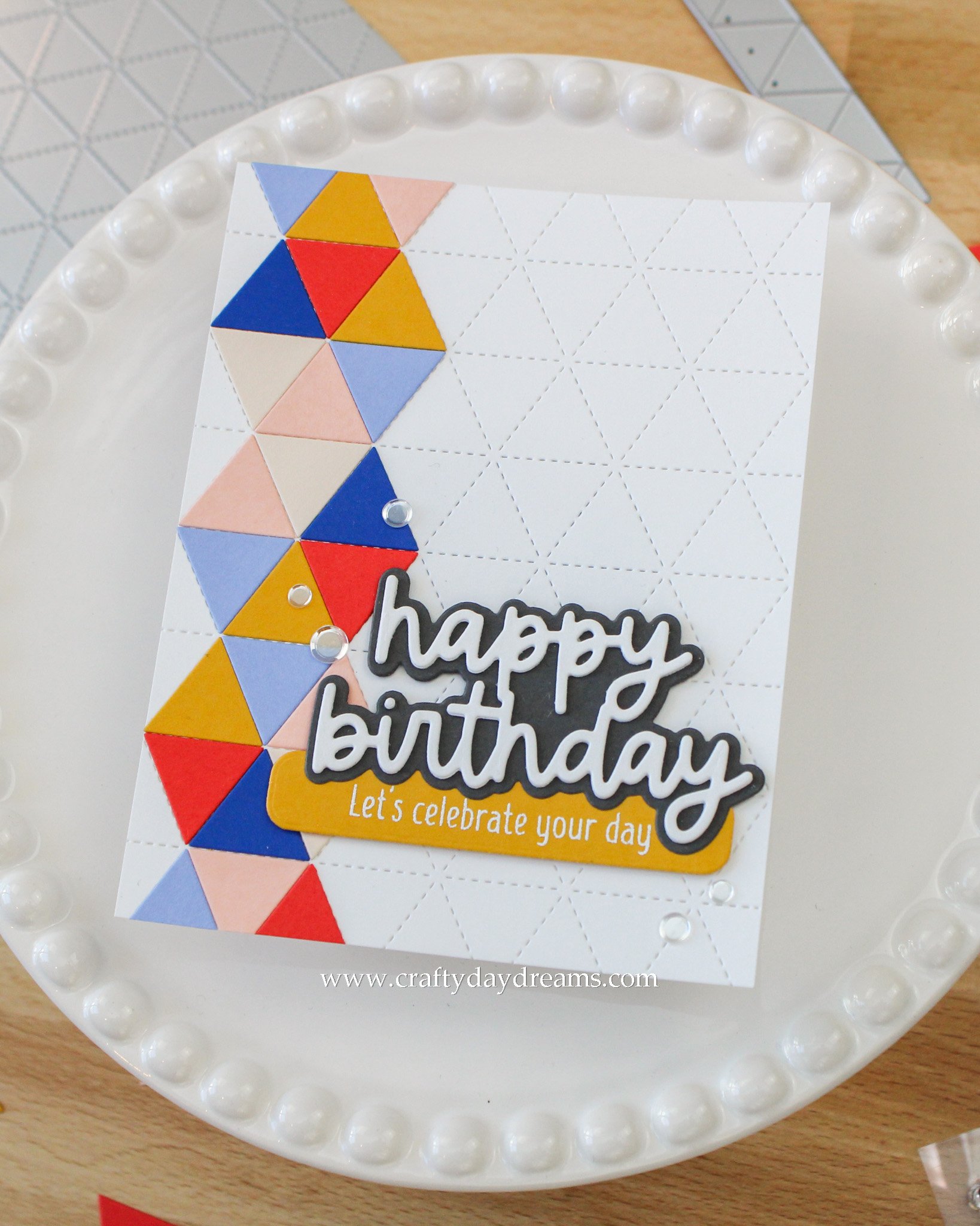
For the sentiment, I was originally thinking of only using a die cut greeting, but as you can see, I didn’t stick to that! First off, I grabbed the ‘happy birthday’ sentiment from the Everyday Essentials die set and die cut the shadow out of Mushroom cardstock, and the greeting out of Neenah Classic Crest Solar White 80lb cardstock. I really liked the placement of the ‘happy birthday’ in the lower third of the card, but I felt like I needed a little bit more to the card to really finish it off. I decided to pull out the Celebration Squad stamp set and white heat emboss the sentiment ‘let’s celebrate your day’ on Sunflower cardstock. I love that the sentiment is on Sunflower because it helps to pull more yellow into that area of the card and just ties in so nicely as a whole.
I popped the sentiment up on some thin foam squares, stuck it down, then pulled out my Rock Candy sequins again. This card is a little bit of an awkward one to embellish, but I focused on odd numbers and leading the eye from the top of the sentiment on the left side, through it and to the bottom on the right side.
A Block of Color
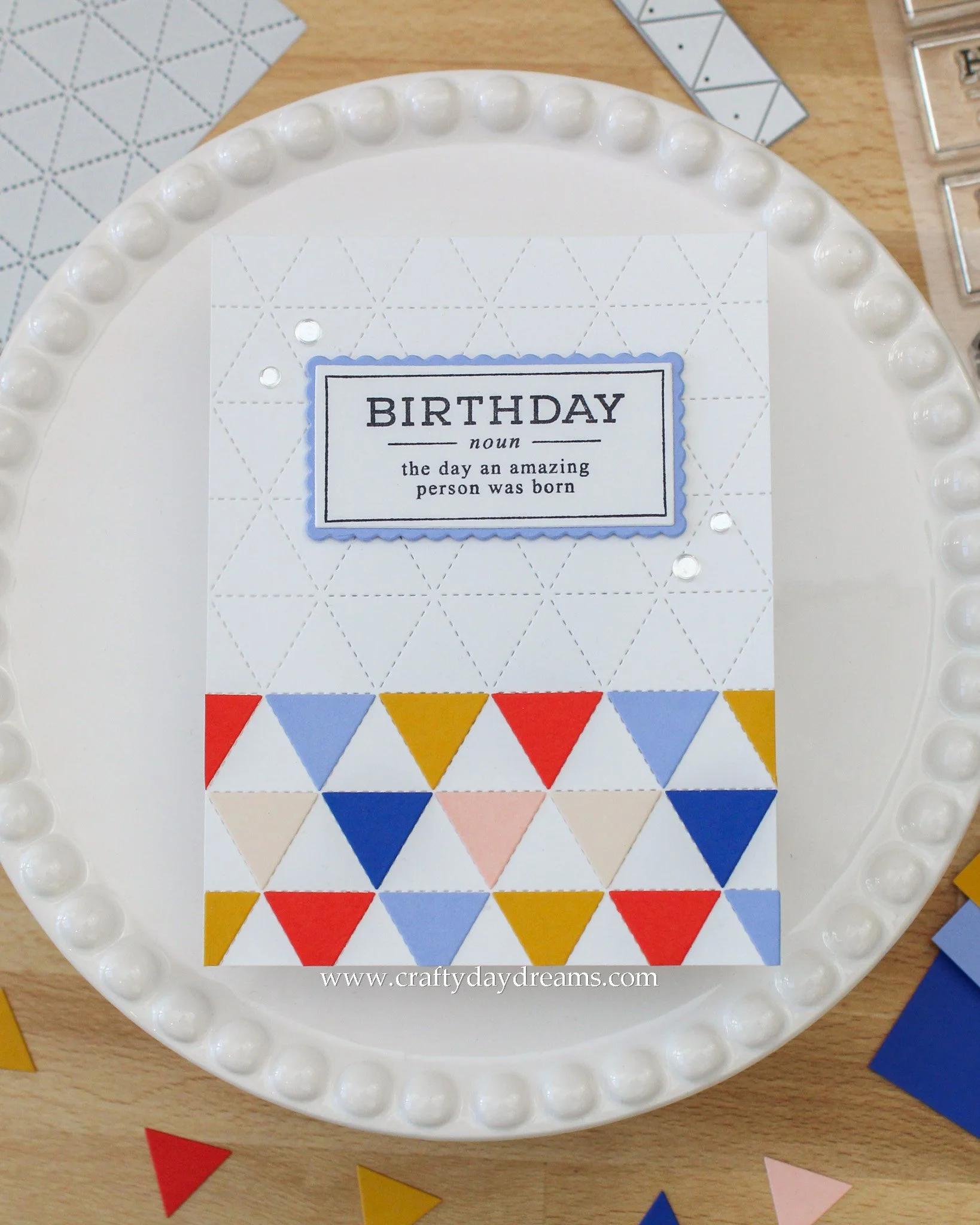
This last one was one I created with my small amount of extra triangles leftover from the past two cards. My only goal with this was to not die cut any more triangles! I decided to use them a bit more sparsely and just do rows of alternating color. Not too bad, right? Once again, when I was happy, I glued the triangles down on a panel of 80lb Neenah Classic Crest Solar White cardstock that I ran through my die cut machine with the stitching die from the die set.
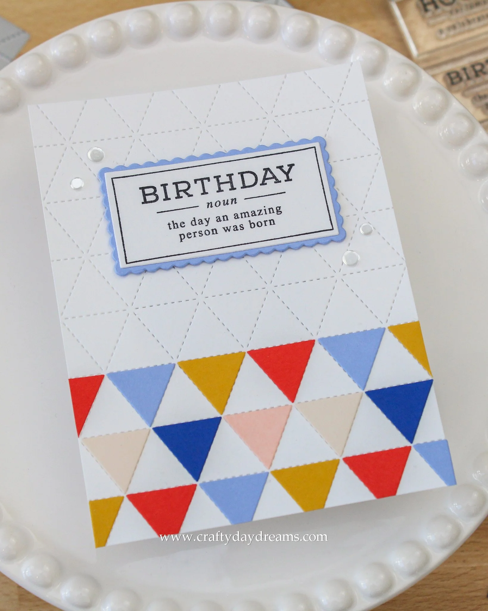
For a sentiment, I pulled out the Defined stamp set and stamped the birthday sentiment in black ink. I die cut it with the straight rectangle die from the coordinating die set, then die cut the ruffled rectangle from the set out of Bluebell cardstock. I love that this pop of Bluebell behind the sentiment really brings it up the panel and makes it the focus color of the card. I popped the sentiment up on thin foam squares and glued it down near the upper third of the card.
To finish the card off, I grabbed the same Rock Candy sequins again to keep things consistent and added 4 to the card. When embellishing weird shapes, I tend to break the ‘rule’ of keeping things in odd numbers, and instead just mirror the design around the shape. This card, to me, felt ‘weird’ because the bottom of the panel was taken over by color and essentially split the panel, making the only part to embellish the upper half.
That finishes off this post! I hope these cards inspire you to play with color today, and if you’re looking for your mojo, I hope you find a die like this in your stash to do some mindless creating with! Thanks for stopping by today, I hope to catch you next time!
Affiliate disclaimer: all links to Waffle Flower, Concord & 9th, Altenew, Scrapbook.com, and Spellbinders products are affiliate links. These links allow me to get a commission at no extra cost to you if you use them to shop! All other links provided are links to supplies and shops I am not affiliated with and I do not get a commission from.